Making Live TV Feel Like Streaming
Led a design sprint to redesign Zattoo's Recordings feature across 15 platforms, delivering smart content clusters, batch management, and series playback that increased watch duration.
Sprint core team
Member of the cross-functional sprint group from discovery to delivery
Prototyping & testing
Built hi-fi prototypes and facilitated user testing sessions
Design systems
Consulted on the design system and delivered production-ready mockups
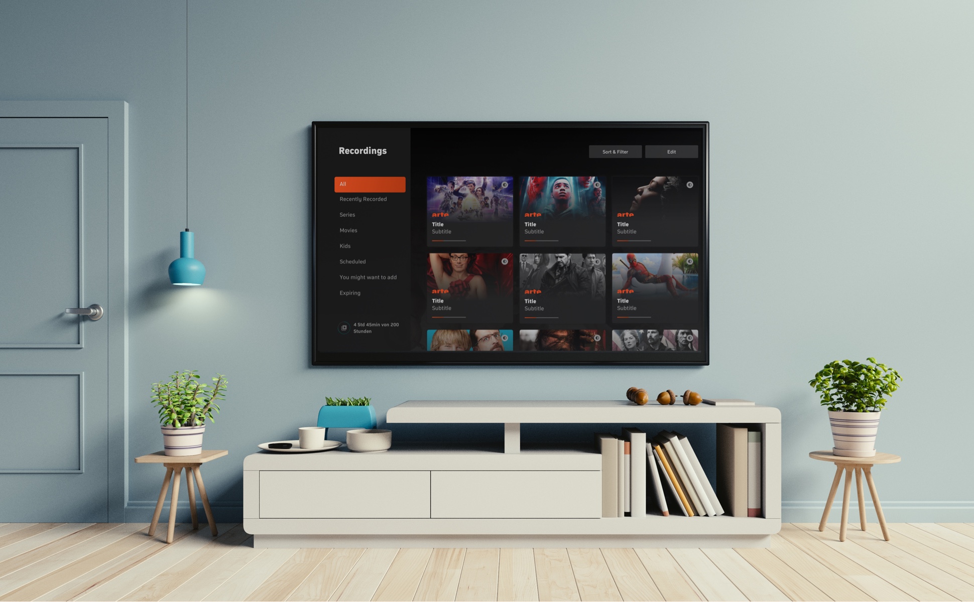
TV, but make it smart
Zattoo is a live TV streaming platform available across a wide range of devices. One of its most popular features is the ability to record live TV shows (TiVo style).
The recordings page was a flat list. Hundreds of shows with no way to sort, filter, or binge. Our goal: fix how users find and manage their recordings across all 15 platforms.
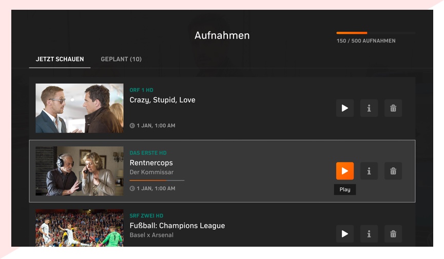
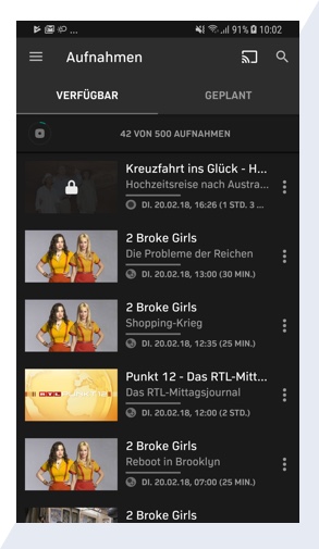
Everyone in the same room
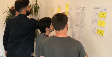
The project touched multiple teams and platforms, so we ran a design sprint to frame the challenge and figure out which direction to take.
The core team: product owners, designers, engineers, BI, and customer success.
After lightning talks, contextual inquiries, and data analysis, we grouped insights into 4 themes:
Content Discovery
Enable users to discover new recordable content on the recordings page
Tailored Search
Make it easier for users with hundreds of recordings to find the ones they are looking for
Management
Offer a less cumbersome way to delete unwanted recordings
Playback
Give users a seamless way to watch recorded serial content (TV shows)
What does winning look like?
These hypotheses defined our success metrics:
We Think That
Users have a hard time watching the piece of content they want because we offer a limited way of browsing and finding it
Which is Why
We will increase the number of hours watched per user for recordings
We Think That
Many users are unaware of the perks of recording live TV content
Which is Why
We will increase the share of users adding at least N new recordings per month
We Think That
Users are afraid to record new content because they find it very difficult to delete unwanted recordings afterward
Which is Why
We will increase the average amount of recordings each user adds to their account
We Think That
Users can't watch serial content seamlessly because we don't group episodes & seasons of a show together
Which is Why
We will drive a spike in new recordings and serial content playback
From sticky notes to pixels
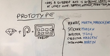
We narrowed down solutions and built hi-fi prototypes with the help of our design system and software engineers.
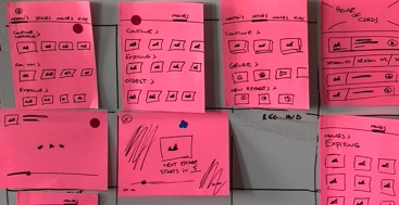
Prototypes meet real users
With the prototypes ready, it was time to test them with real users. Our goals were to:
- Validate the hypotheses with real users
- Test the discoverability of new components like sorting, batch deletion, and series drill-down
- Gauge satisfaction with the new interaction flow
DVR that feels like streaming.
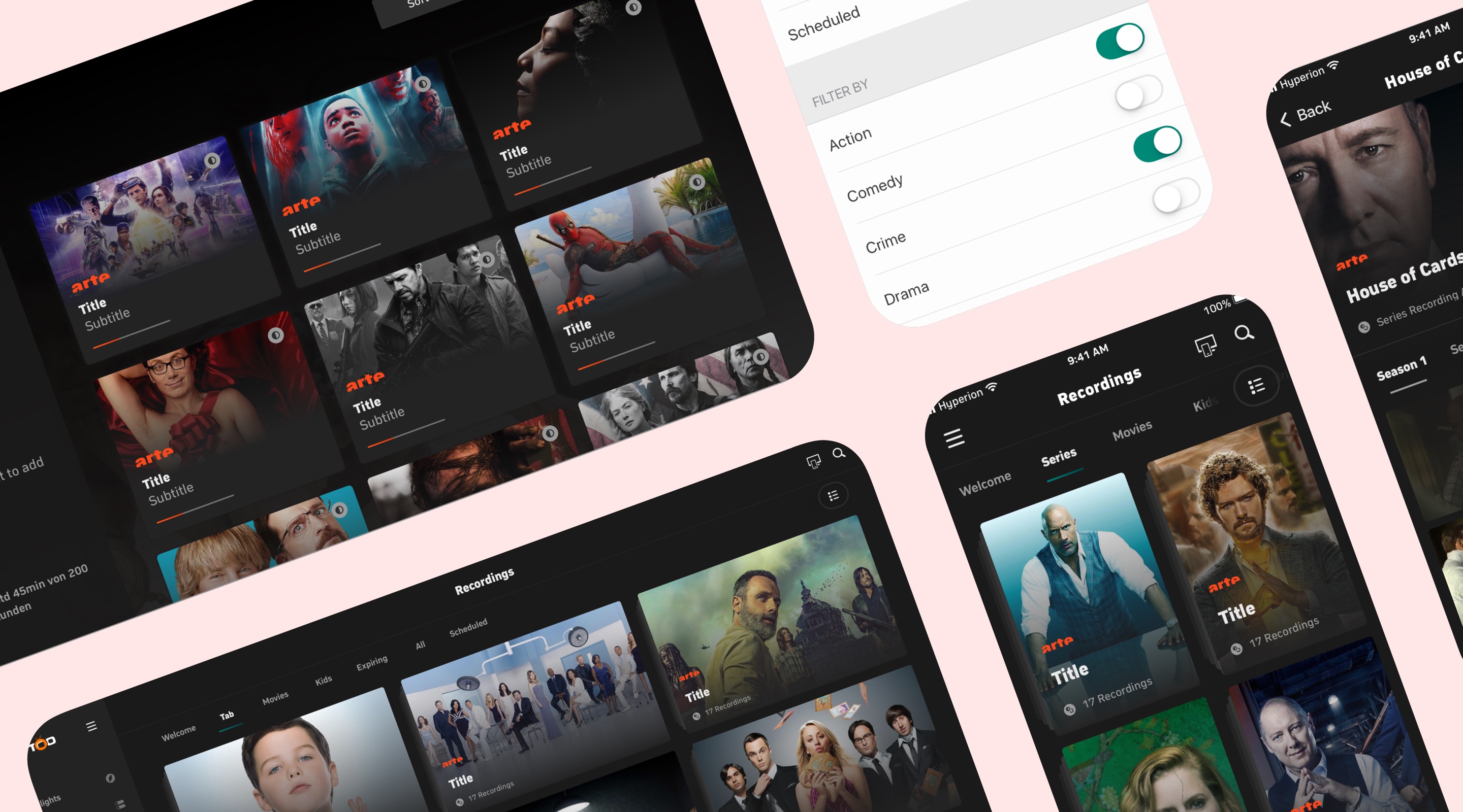
Here's what we shipped across 15 platforms.
Find something worth watching
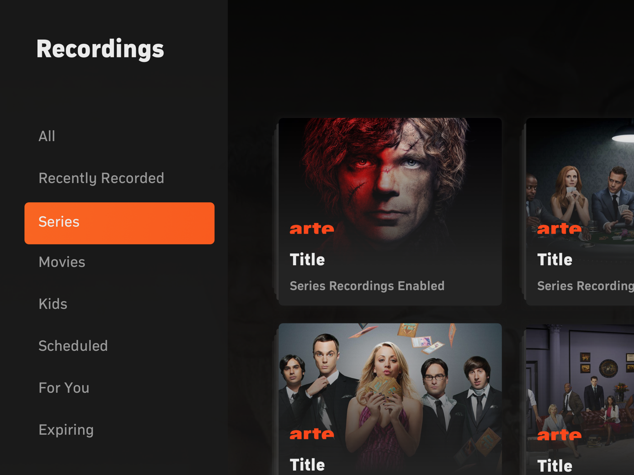
Instead of one big list with all available recordings, we grouped content under smart clusters powered by machine learning.
Clean up in seconds
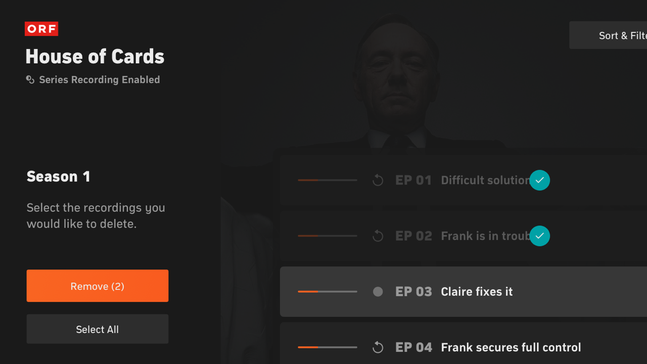
With the top tier allowing up to 750 recordings, freeing up space was a herculean task. Batch deletion made it painless.
Find exactly what you want
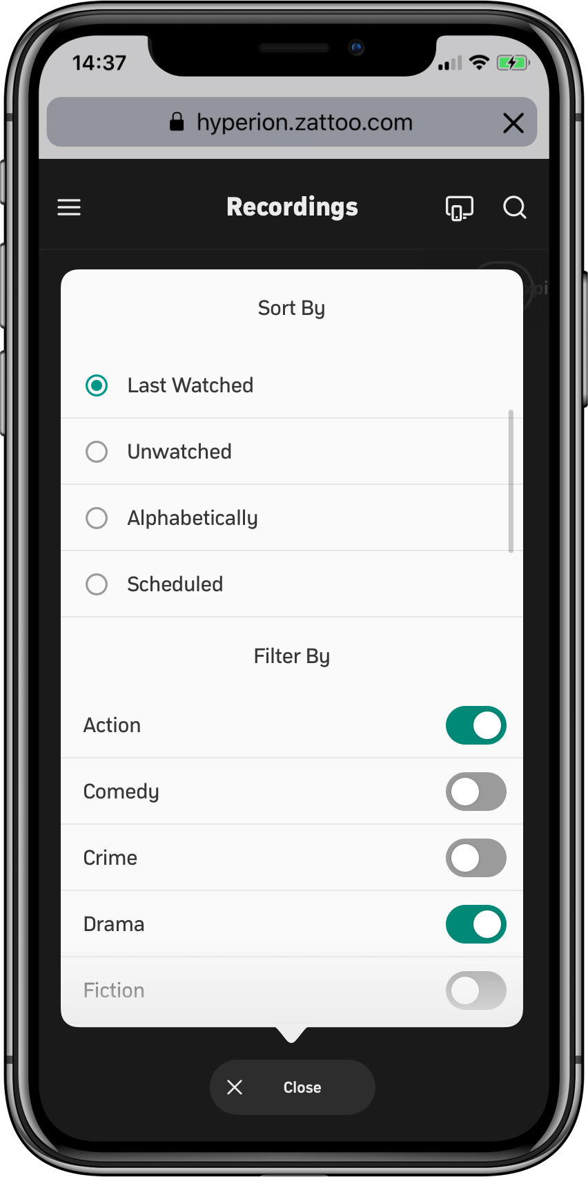
A comprehensive filtering system for users who need to cluster content beyond our predictive suggestions.
Binge your recordings
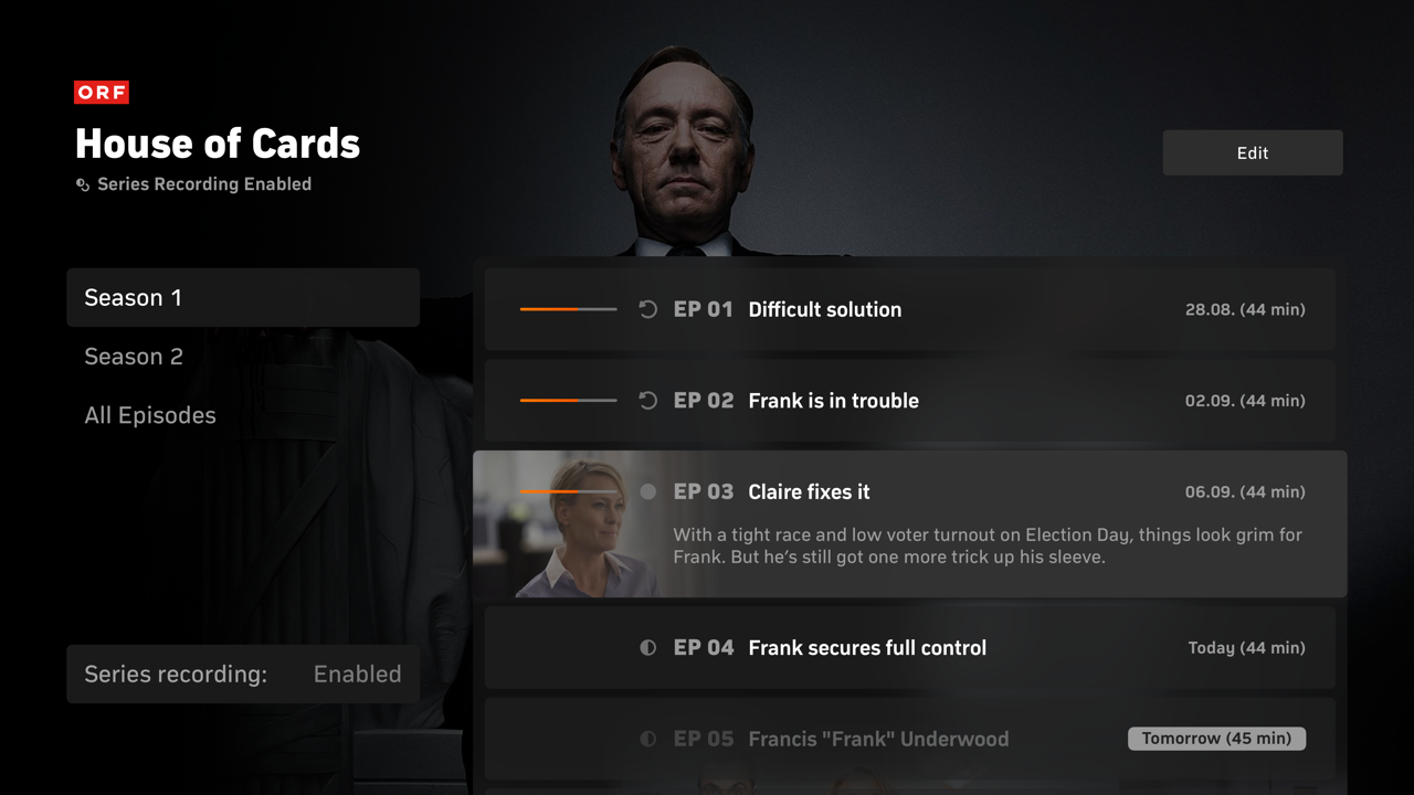
We brought the same binge-watching convenience of streaming platforms to live TV. Episodes grouped by series, watched sequentially.