Shipping Design at Enterprise Scale
Refined a contactless fuel payment feature, then led its integration into the Mercedes Me app and in-vehicle dashboard, bringing it to millions of Mercedes-Benz owners.
End-to-end design
Designed the improved payment flow from exploration to delivery
Integration lead
Led the integration of the feature into the Mercedes-Benz mobile apps
Advisory
Played an advisory role in the integration of the feature in the vehicle dashboard
Yes, that Mercedes-Benz
A contactless fuel payment feature needed to work across countries, payment providers, and business units. The story breaks down into two parts:
Iterating on an existing feature
Leading its integration into different ecosystems
First, meet the key players:
Bertha
Bertha is a spin-off app from Mercedes-Benz that allows people who don't own a Mercedes to browse for cheap fuel prices and pay for fuel straight from the app.
Mercedes Me
Mercedes Me is a companion app that enables Mercedes-Benz owners to interact with their vehicles and purchase additional services.
Two goals, one shot
While leading design on Bertha, I was asked to explore what an integration with Mercedes Me could look like. This was peak pandemic. Social distancing shaped every decision.
After a few product discovery sessions, we decided to break that down into two phases:
Perfect the digital payment flow
As Bertha Pay (the digital payment SKU) was already live for some time, we had a juicy repertoire of insights on improvements we could make and opportunities to explore.
Integrate the feature into the Mercedes-Benz ecosystem
The goal was to enable Mercedes-Benz owners with a contactless and convenient way of paying for fuel without going into a gas station.
Nothing about fuel is simple
There is nothing trivial about letting people pay for fuel from their phone. The ecosystem is fragmented: different companies own different parts of the journey, and the consumer feels every seam.
The Bertha design team shipped a solid first iteration. To take it further, we needed to look closer at the most common journeys and optimize them.
In terms of journeys, in Europe, there are two major payment flows and they depend on the country you are in and the station brand. They are:
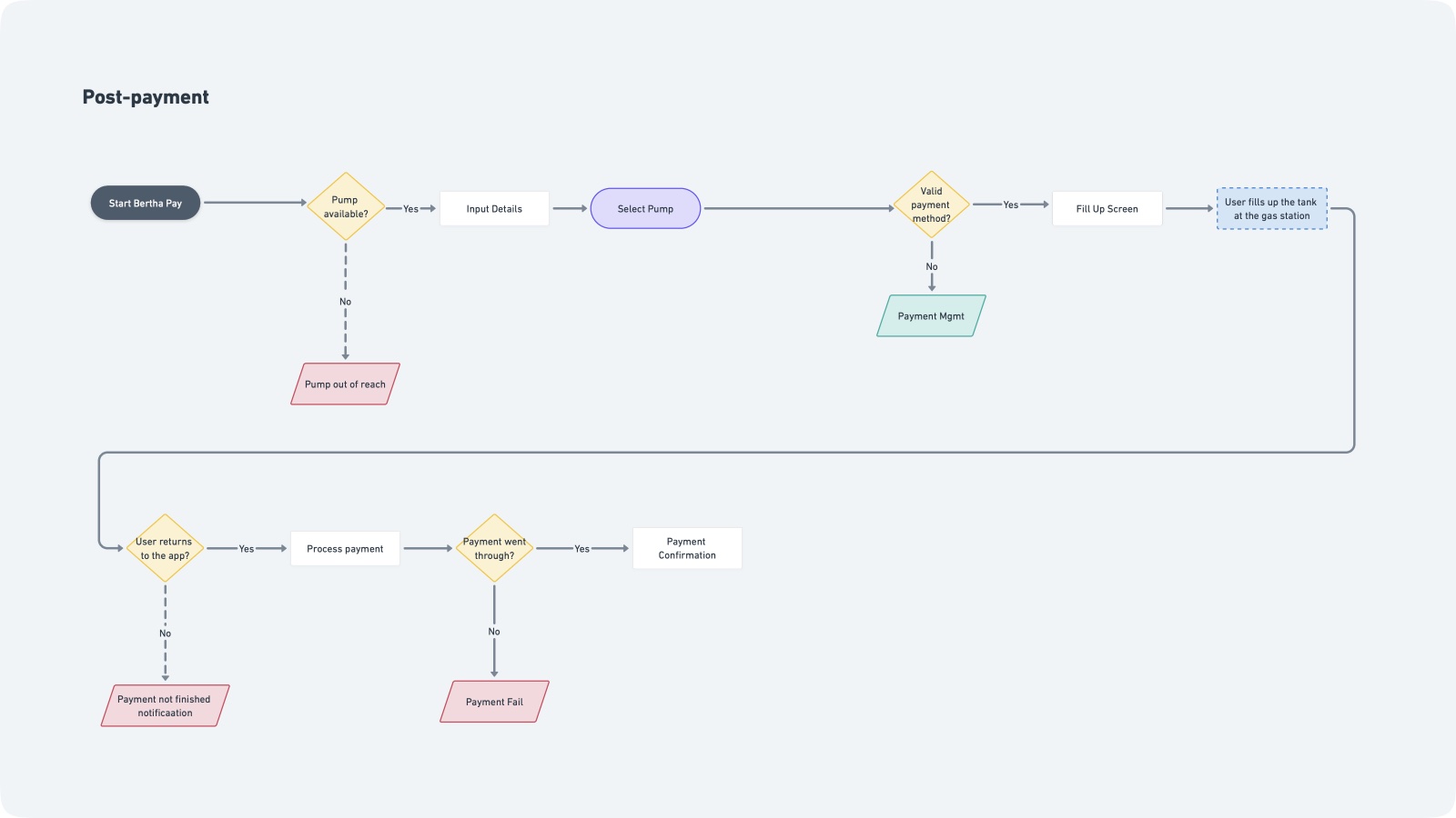
Post-payment
Most common at supervised stations, where there's a cashier available at all times to process the payment.
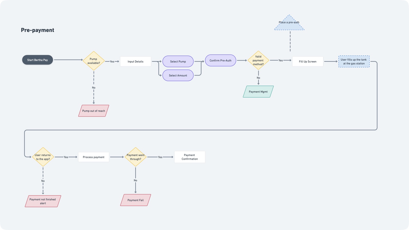
Pre-payment
Most common at self-checkout stations, it's a way for the station to know the customer can pay for the fuel.
Talking to everyone who touches a pump
Here's how pre-payment works, and where it broke. We went through the entire journey to understand where people got stuck, which tasks we could simplify, how to strengthen the value proposition, and how to optimize the revenue streams.
We approached the problem framing from several angles, including:
Discovery sessions with stakeholders
To align on expectations, define key metrics, and better understand the dependencies
User Research
Qualitative ≈ 15 users, Quantitative ≈ 1k users
Field sessions at gas stations
To observe in real life how consumers and station staff interacted with our solutions
Lightning talks with Customer Service
To surface the most frequently reported complaints
Deep dive into the payments API
To understand which kind of data we could pull from the payment gateway API
Kill the noise, find the signal
These bets shaped everything we built next:
We Think That
People feel uncomfortable paying with their phones at a gas station when they get the dirty looks from other customers who are unaware they can pay digitally
Which is Why
We need to reduce the time Bertha Pay users spend at the gas station
We Think That
People get anxious about something going wrong with their payment once they leave the gas station, as it can often lead to a police report
Which is Why
We have to be more explicit as to when it's safe to leave the gas station
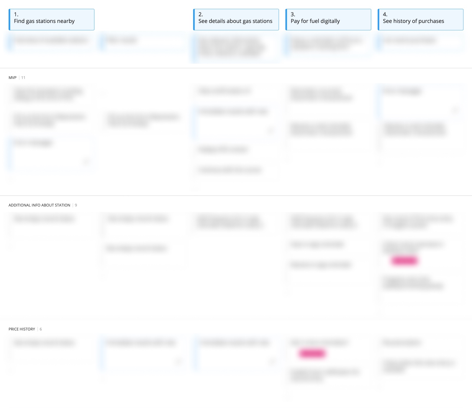
Bertha Pay 2.0
Better. Faster.
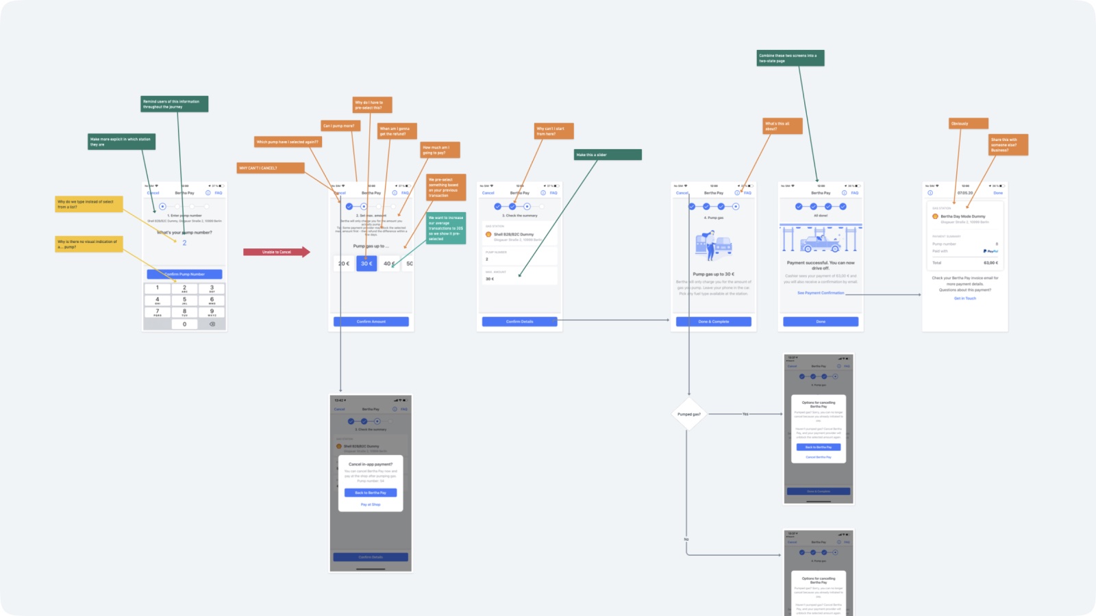
Fast-forward a couple of months, a few dozen prototypes, usability tests, and way too long e-mail threads, here are the highlights of what we shipped:
Tap, not Type
We fetch available pumps automatically, so drivers select with one tap instead of typing numbers at the station.
A quicker decision-making metaphor
We replaced a clunky step with a one-hand interaction that makes amount selection faster and easier under real pump conditions.
Leave in peace
While payment is processing, clear status copy reassures drivers they can safely continue without second-guessing.
Cross-app Awareness
Some banks show temporary payment states. We added contextual guidance so users understand what they see in banking apps versus our flow.
Safe Travels
The final screen highlights only what matters before leaving: payment status, next step, and confidence to drive off.
Sweet Branding
We refreshed Bertha Pay branding in-flow to make the experience feel consistent, modern, and recognizably Mercedes-grade.
Now do it again, everywhere
Now that we managed to perfect the feature, we felt confident enough to expand it to millions of happy Mercedes-Benz owners.
Remember: two-step project. Here's what Phase 2 was about:
Integrate the feature into the Mercedes-Benz ecosystem
The goal was to enable Mercedes-Benz owners with a contactless and convenient way of paying for fuel without going into a gas station.
During the discovery & exploration phase of the project, we already looked into what was available in the Mercedes-Benz ecosystem and spotted existing touchpoints we could tap into.
Mercedes-Benz already had a charging service for electric cars. Same infrastructure, different fuel. That made the integration far more resource-efficient.
Designing is the easy part
At Mercedes-Benz, different features live in different business units, each with their own priorities. To ship across all of them, I had to build relationships before I could build anything.
To move forward, we created a few tools that helped us navigate across teams. Those conversations were key. They helped us understand the ecosystem we were trying to break into and how to integrate with what already existed.
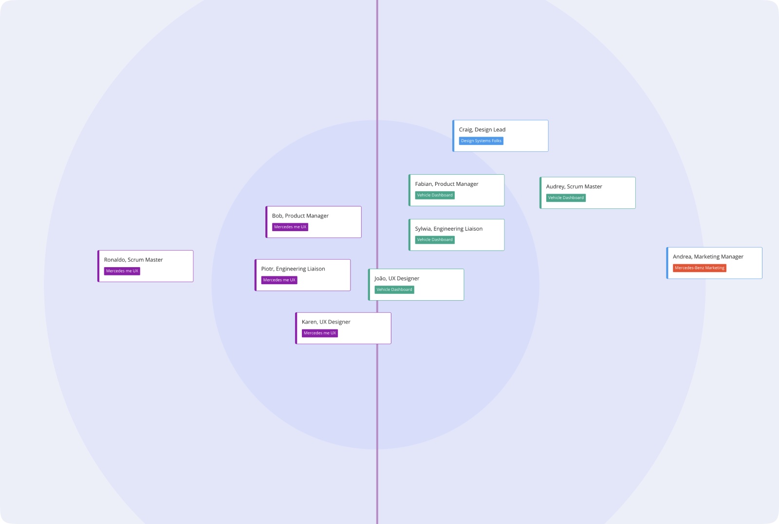
Stakeholder Map
A simple but efficient map with the owners of each topic so I would always have people making decisions involved at all steps.
Problem Framing Canvas
I shared a problem framing canvas that helped people from different units to understand where we were coming from, what we had learned, and what we were trying to accomplish.
User Story Map
One of the risks of working with different divisions is losing sight of who is doing what. The story map helped me better prioritize tasks and understand with whom and when to follow up.

What did I actually do?
- Made sure everyone understood what we were trying to build
- Kept the right people in the right conversations
- Found answers to complex questions
- Together with designers from other units, transposed the experiences
- And most importantly, oh well, delivered
Meet Mercedes-Benz Fuel & Pay
In less than 6 months, the new SKU was live across the Mercedes-Benz ecosystem. Early adoption was strong, and subscription numbers beat the original forecast. Here's the press release.
The full journey
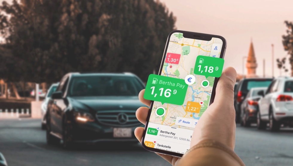
From finding the station, to selecting the pump, paying, and driving away. The complete Fuel & Pay experience.
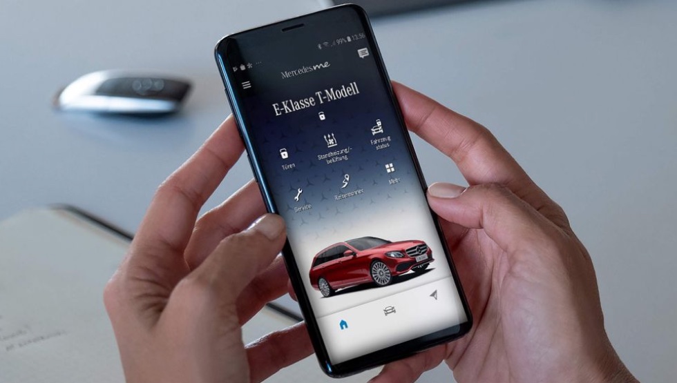
Mercedes Me integration
Fuel & Pay living inside the Mercedes Me app, seamlessly integrated with the existing vehicle services ecosystem.
One-hand operation
At the pump, one hand is usually busy. This flow lets drivers return the nozzle and finish payment on the phone in a few quick taps.
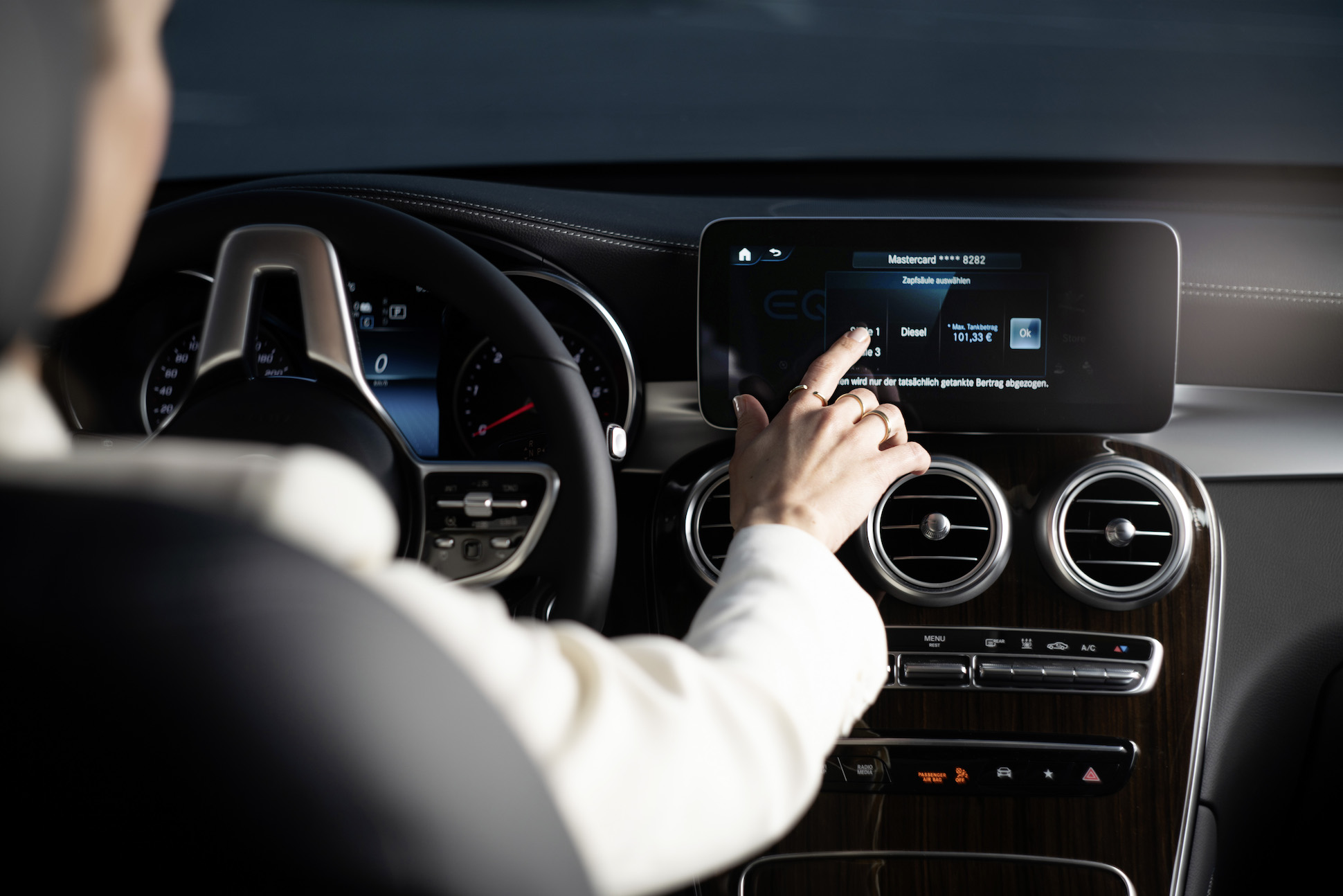
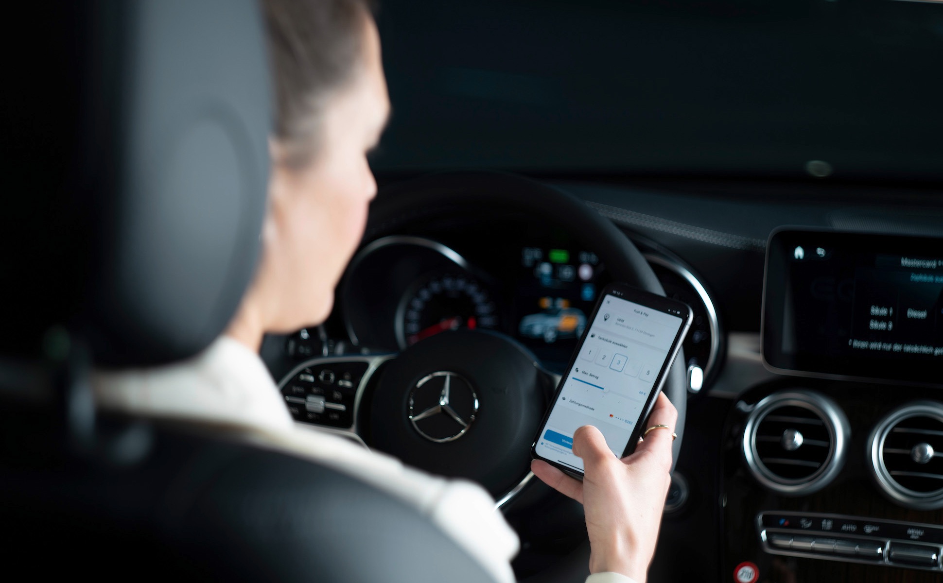
Dashboard integration
For drivers who prefer staying in the car, the same payment flow can be started and completed directly from the dashboard.